Sign In
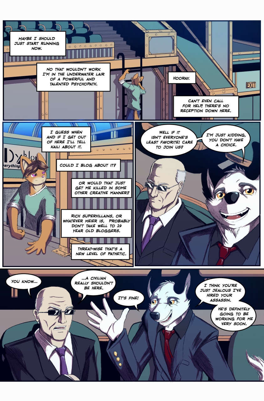
CloseWhy the lettering looks different:
A friend and peer of mine said it was the only thing they didn't like about the comic so I worked with them to come up with a solution and the result is slicker lettering that I think works better with how the art looks. We're working to re-letter the other pages of this issue so that, when it sees print, there's some consistency chapter wise. I don't necessarily mind the previous chapter looking different as this comic is a work in progress and I also don't plan to go back and re-draw the first issue. If I re-did every part of the comic every time I got better then I'd have to be re-doing the whole thing every couple of pages!
Submission Information
- Views:
- 1234
- Comments:
- 1
- Favorites:
- 3
- Rating:
- General
- Category:
- Visual / Digital


Link
penombre
Powerful? talented? psychopath? You forgot ruggedly handsome too! The lettering does look a ton better,and I'm glad you seem to have found the time to work on these pages lately!