Sign In
Close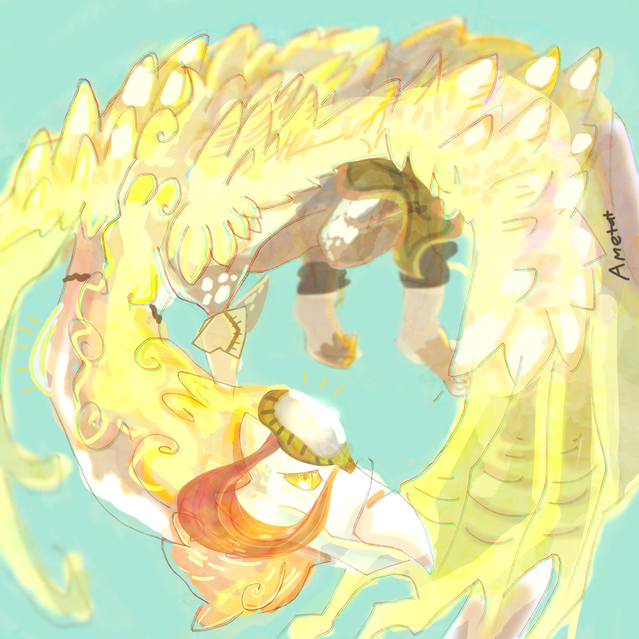
A commission from Luunai on flight rising. I'm feeling kind of anxious right now so I may unnecessarily delete it heh.
Words of advice are appreciated! It is missing something.
Submission Information
- Views:
- 309
- Comments:
- 2
- Favorites:
- 3
- Rating:
- General
- Category:
- Visual / Digital
Comments
-

-
Thank you so much for the critique! I'd like to continue experimenting with three d effect lines, they look totally cool. I do love my highlights, it helps cover up my weird painting with sparkles.
And yes I'll try doing darker backgrounds, you can see I'm pretty fearful of them and tend to stick to Seafoam coloured backgrounds in my art, I suppose it covers up my lazy stray lines better than a dark one haha. Oh I never noticed about the misaligned colouring, thank you for pointing it out, I suppose it does look odd along those wings and especially on the neck. I think I need to stop being so lackadaisical with my art!
-
Link
nolongeractivehere
Really nice work with the lines here, and the colored effect on them looks terrific. If I were to make any suggestions, I would say make the background a darker value, since the picture as a whole is very light, and a greater range in values would really emphasize the perspective and spacial difference here. And a small change, perhaps singularly to my taste, would be to make your colors fully align along the edges of the line work, giving it a more clean and crisp silhouette to keep the shape recognizable and strong. Otherwise, the piece is wonderful and really quite a gem to look at with great use of highlights and blurred shapes.