Sign In
Close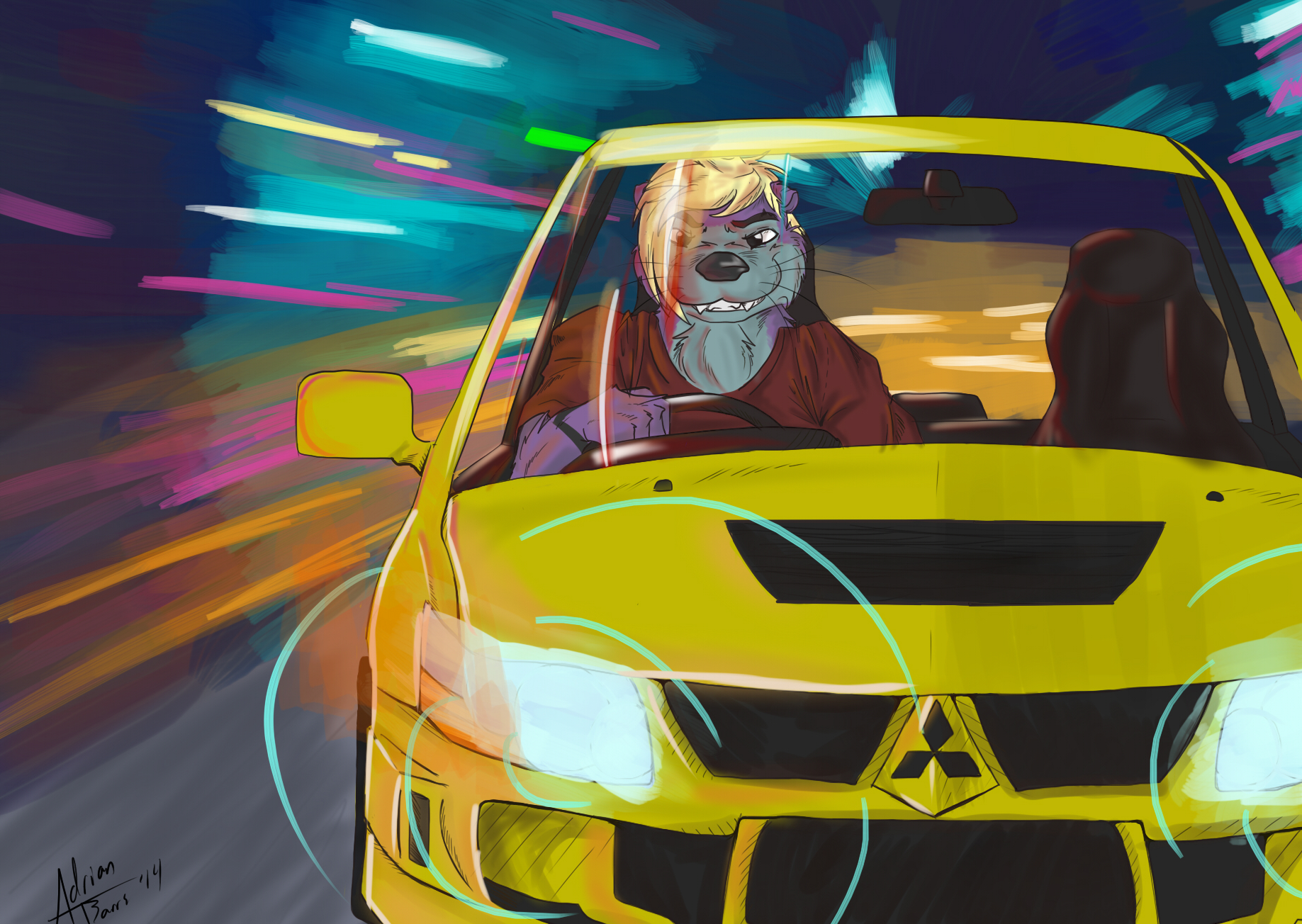
Picture for Captain_Otter over on FA
The car was difficult to draw, as was the time lapse. I rarely color let alone do a bunch of bright and reflective light.
If you have any tips or if anything looks odd, let me know! I need to get better.
Also, the time lapse kind of looks like warp speed. It's hard to make it not look like that. Ended up using almost 100 layers. I'm sure if I could use the tools correctly, it would be less. :P
Submission Information
- Views:
- 275
- Comments:
- 5
- Favorites:
- 3
- Rating:
- General
- Category:
- Visual / Other
Comments
-

-

Not sure how I did 100+ layers, it was kind of a pain though. haha. I thought the same about the side mirror, I will see if I can work with it a bit. I tried darker darks and brighter brights, but I had a lot of issues. Like I said, it's rare I color, let alone color with contrast and reflecting light. So this was difficult. But yes! I do agree with you, being darker and brighter would be nice :P
-
I bet. x.x I can sort of imagine how you got there, it's an impressive feat haha.
Well, I took the liberty of just doing some haphazard burning and dodging on your piece reaaaaal quick, to just give you a visual representation of what I'm talking about. Most importantly, features like the headlight on the right (looking at the piece) need to show that they're producing light and in turn, causing far more contrast.
http://i.imgur.com/2APufuk.png
I will delete the image after. ^^;
-
-
Link
Rory
Almost 100 layers?! How?!!
Asides from that, this looks like it came out of Need for Speed Underground, which is an awesome, awesome thing. I looove seeing anthros in cars for some reason, and this does not disappoint.
As for critique... as someone who just tried to draw a car yesterday and failed miserably at it, you did a nice job. The side mirror looks a little too flat, it doesn't show depth correctly to me, whereas the front of the vehicle looks like it does. On a more personal level, this is a piece to me where it could benefit from a vibrancy boost in some aspects. It's not often I get to see people play with super vibrant colors in a night time setting, so it sets up the stage to do some really neat contrasts. The darks could be darker, and the lights could be a bit brighter. As I said, it's more of a personal preference than a critique, but it could be something to think about.