Sign In
Close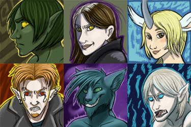
Here's some icons I did for some people over at Teenycom on livejournal. :3
This is an older example of what my sketchy icon commissions look like.
The characters belong to their respective owners. Please do NOT use these icons unless you're the one I made them for.
Submission Information
- Views:
- 232
- Comments:
- 2
- Favorites:
- 0
- Rating:
- General
- Category:
- Visual / Digital
Comments
-
-
Thank you! I'm still pretty new with color theory, and how to make skin look less cartoony. I'm not sure how to improve that though other by just practicing with skin more and by taking more time to notice what sorts of color goes into skin and such. As for the elf-looking guy, he was actually of a species made up by the commissioner, who requested the facial geometry be a certain way, though looking back, I'm pretty sure I didn't do a very good job of making it seem like it was meant to be that way as opposed to bad anatomy. Thank you for taking the time to critique this! :)
-
Link
OVERLORD
Well, if you're after critique, I think that the skin of the human-like characters is quite monochromatic, making it appear cartoony. But at the same time, they do look like they're meant to appear cartoony, so I dunno. The facial geometry of the elf guy is a little unusual (the nose is very long), and the ears recede beyond that which might be considered normal. Although it's hard to tell perfectly, as his hair is obstructing it somewhat.