Sign In
Close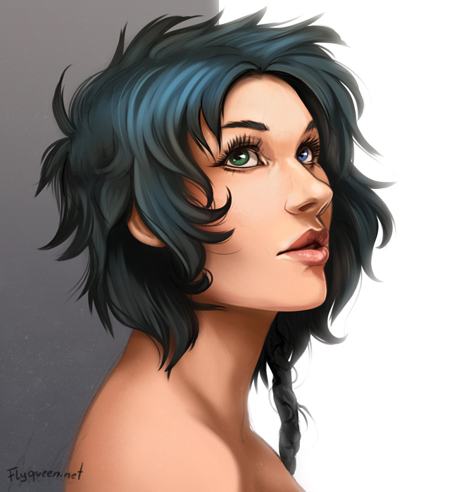
![T-Rex [Repost]](https://cdn.weasyl.com/static/media/ef/fc/4e/effc4e6fe125699d69becf59bbedc7443ae91b6bc088a2a913c28bd46019df5f.jpg)
Yesterday I painted a face and I was so unhappy with it. So i tried again today...
And I'm still not there yet. Specially the hair is very messy.
But anyway I put it up here for critique (But please be gentle, I currently really HATE my stuff X_X)
I wanted to make it not fully realistic, but a little bit cartoon-styled...
Blarb X_X
Submission Information
- Views:
- 1280
- Comments:
- 31
- Favorites:
- 75
- Rating:
- General
- Category:
- Visual / Digital
Comments
-

-

The skin tone looks pretty natural, at least on my monitor. The only thing that seems slightly off is her back and shoulders, they have a red tint that reminds me of someone who's been standing too close to an infrared heat source (saw it a lot when working at restaurants).
That's the only thing I really noticed, I think you did a pretty damn good job of capturing a realistic-yet-cartoonish style.
-
Thank you for mentioning that! I changed it a little to fix this a bit...(hard to tweak, i messed up there X_X)
Also thank you for your kind words...It's really appreciated!
-
-

Sweet merciful fuckin' BUDDHA this is awesome. How long you been drawing?
-
°o° Oh...äh...hmmm...
I draw since i'm a child, but i "really" started 3 years ago (with learning and looking up references etc.)
-
-

Agreeing her shoulders look a bit red but that can also be simple stylistic choice; some people draw noses or shoulders and elbows as very red. Otherwise I can't see anything amiss, she's lovely.
-
Thanks :) Yeah, i usually do that too, but it was a little too much i guess ^^; I reduced it now...
-
-

Oh my God.... Please tell me, that you'll be at EF this year. O_O ....
This picture is amazing, it looks so realistic and still not too realistic. Amazingly done. I love how you did her lips and eyes.
-
I will be at EF ^_^
And...thank you for your kind words ^^=
-
-

gorgeous
-
°////° ohmy!
-
-
Actually... Rotarr.. this is REALLY beautiful.. Not everything needs to be super refined and I, myself, truly appreciate that raw painted feel that accents people's art. It's amazing, also.. I'm kinda jelly how well you can do lips. That's one thing I struggle with like CRAZZZY! I hope you post more beautiful pieces like this ^^
-

Im not much of a human artist but I must say that looks stunning. I dont see anything notable enough to critique.
-
Thank you! I'm glad you think so :>
-
-

I spent a few minutes looking for anything that might need correction and I couldn't find anything. I think the only things that could be changed would be done entirely for personal aesthetic reasons on your end like how you want the hair to look.
SO yeah, as far as I can see everything is proportionally correct, and I honestly love the way she looks =D I'm particularly impressed with how you drew the nose! human noses are just really tough to get right @_@
-
Noses are my weak spot, that's why i probably spend so much time on it ^^; And now I still see some things that needs fixing. This is a never ending story with human faces XD
But really thanks for your kind words. I really appreciate your input! (And yeah, maybe i will work on the hair a bit more. It's not fitting the rest right now...lazy me v_v)
-
-
Wow, that is amazing. O.o
-

Looks gorgeous on mine!
-

I'm just so happy to see a human face ;.; it looks really good to me. I love her mismatched eyes. I think you did a really good job, imho
-
Yeah, the eyes XD She is actually an old character of mine i reworked a bit. Only thing that stayed are the eyes.
Also...yesss. A little bit more human never hurts :>
-
-

Dude whoa this is amazing! I had no idea you were so skilled at (semi?)realism!
-
Ahh...yeah. I'm always trying. Actually i always wanted to paint realistic, but...it's just not my thing. So I try to keep personal style in the painting - as it is in the Sketch...
Also thanks for your critique, i always have problems with the planes of the face. Specially when i start painting, i always forget to check this basic things again X,x
-
-
Oh I noticed that you have requested critique. Ahaha. I'll try to offer some, since I can see a couple things.
Her far eye seems a bit more narrow than the one closest to the viewer, and the far side of the face is consistent with that, giving it a slightly squished look. Also, the horizontal angle of her nose(if you were to draw a line across the nostrils) is not parallel with the lines of her mouth or eyes. It's just sliiiightly off, and gives a bit of an impression of being kind of crooked, with the underside angled towards the viewer.
These things are very slight, but that's about all I can think to mention. It looks fantastic overall! -

ouo this is amazing! You should have more confidence in your work sweetie! :3
My only critique is that lil line below the bottom lip the curves into the top part of the chin. I don't think it needs to be there.
But this really is a great piece of yours <3 you should do more portraits! -

Very beautiful, Rotarr!
-

Skin color looks perfect to me. The whole picture looks all around beautiful. The only thing that bothers me about it is the braid. It doesn't look quite right with the S-shaped lines going down it. I'd suggest using photo reference to see how a braid looks, but if you want the quick and dirty way, just draw alternating criss-cross lines going down, then erase the ends of the lines where it meets another, then use that as the framework. (Hard to explain in text, easy to draw once you understand it.)
-

I honestly think all artist's are their own worst critics. I don't know why you are so down on yourself, it isn't healthy. It is wonderful to always strive to be better, but you are seriously amazing. I love the style, design, and emotion of this! She looks very beautiful! I need more practice with females. I am pretty good at male humans, but I don't practice women enough. They ONLY critique I would have since you are striving to improve, is that the 3 quarter eye (her left eye) is a bit smaller than her right. It should be the same size as the one closest to us, but in perspective. I struggle with that sometimes too and fought with the eyes of this one character of mine for like EVER until I realized I had made his farthest eye too small haha.
Link
Rotarr
And...WOW I hope it looks good at your screen. Just realised that it looks totally different on other monitors. Skin-Color is a bitch D: