Sign In
Close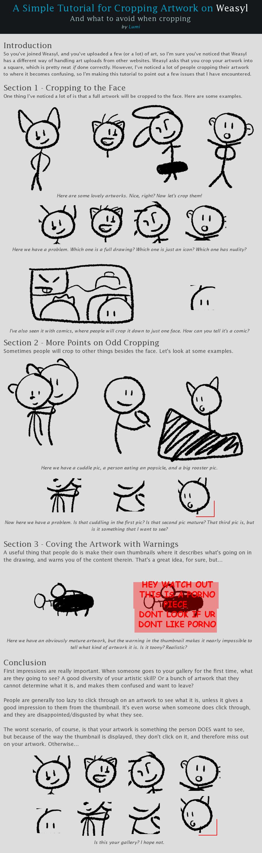

I just made this little thing because I've noticed a lot of confusing things that people are doing when they crop their artwork and I hope that it helps people
Submission Information
- Views:
- 795
- Comments:
- 14
- Favorites:
- 13
- Rating:
- General
- Category:
- Visual / Digital
Comments
-

-

it might be a good idea yea to limit how small it goes, or put up a promt like hey are you sure you wanna crop it this small cuz it's pretty little
-
Yeah, a prompt would even be good! Maybe with a little link to a thing about "how and why to crop your images better", similar to what they have for when you try to use BBcode now.
-
-
it might be a good idea yea to limit how small it goes, or put up a promt like hey are you sure you wanna crop it this small cuz it's pretty little
-
-

When FA's larger preview images were rolled out and it disabled custom thumbnails in galleries it was a happy accident. The admins had been calling to get rid of them, or at least have a user-side option, for a while anyway because it made scanning someone's gallery for AUP violations a right pain in the backside. So nobody really pushed to fix it and I think browsing FA has been better since their demise.
Weasyl's teeny tiny previews with an even smaller snippet of content are one of the few things I really think needs a re-think.
-
yea I really liked it when that happened, I just like having a good context of what I'm about to click on lmao
and yea, even if it was a bigger preview, that'd be pretty cool
-
-

Wow, I've been doing it wrong this whole time! xD;;, Thanks for posting this, it's very helpful and informative. =)
-
Good tutorial, it's why I don't usually crop my pictures.
-

Very cool, I
ll try to remember this from now on!Thumbnails arent something I ever really thought too hard about -

Hehe I actually went back through my gallery a few weeks ago and re-did all my thumbnails to show as much of the pic as possible cos I decided I couldn't stand the cropping feature. Is good to see I'm not the only one.
-

Ohh woow good tips! Well at least we now know what NOT to do!
-

What would you recommend for a pic that isn't square- as in the subject doesn't fit well into a square. For example, a fursuit tail.
-
Focus on the tail, but enough of other stuff in the square to let the viewer know that there is more to the picture than just that
-
I'm actually thinking more about that I just made my first fursuit tail, so I took a photo of it. But I can't get the whole tail because it takes up so much of the photo, so it ends up looking weird being cut off. (I'm not expecting people to be super drawn to see my tail or anything, but I would still like the thumb to look as nice as possible.)
-
-
Link
Trickitt
VERY GOOD.
I was also thinking it might be a good idea for Weasyl to make a fixed crop size to avoid this issue? Like you wouldn't be able to size it down past a certain point, but you could move it around and scale it larger if you wanted. Hopefully it'll get around soon that it's annoying to crop parts of it to avoid limiting an existing feature, if they'd decide to do anything like that, that is. ONE CAN DREAM.