Sign In
Close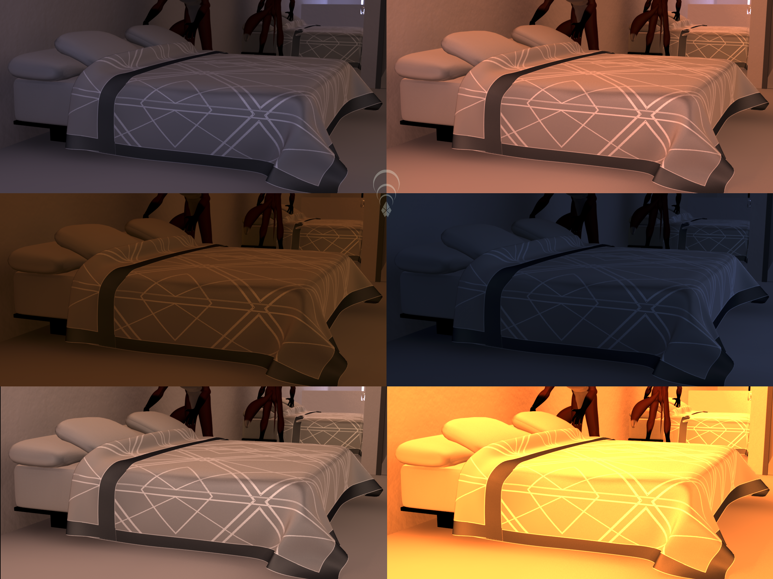
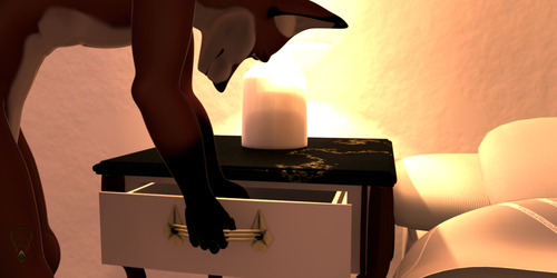

The sheets need a bit of a redo. The pattern highlights the clipping from the original nCloth and it's too flat.
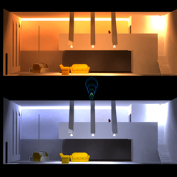
Ran it under various lighting conditions. The shadows are very washed out. I don't like the mirror either, it blends into the world too much. Probably because of the shadows.
Submission Information
- Views:
- 309
- Comments:
- 1
- Favorites:
- 1
- Rating:
- General
- Category:
- Visual / Modeling / Sculpture

Link
X. Cytilinsk
Not sure how I missed this one earlier, those textures look superb! Also I think the mirror looks very nice personally.