Sign In
Close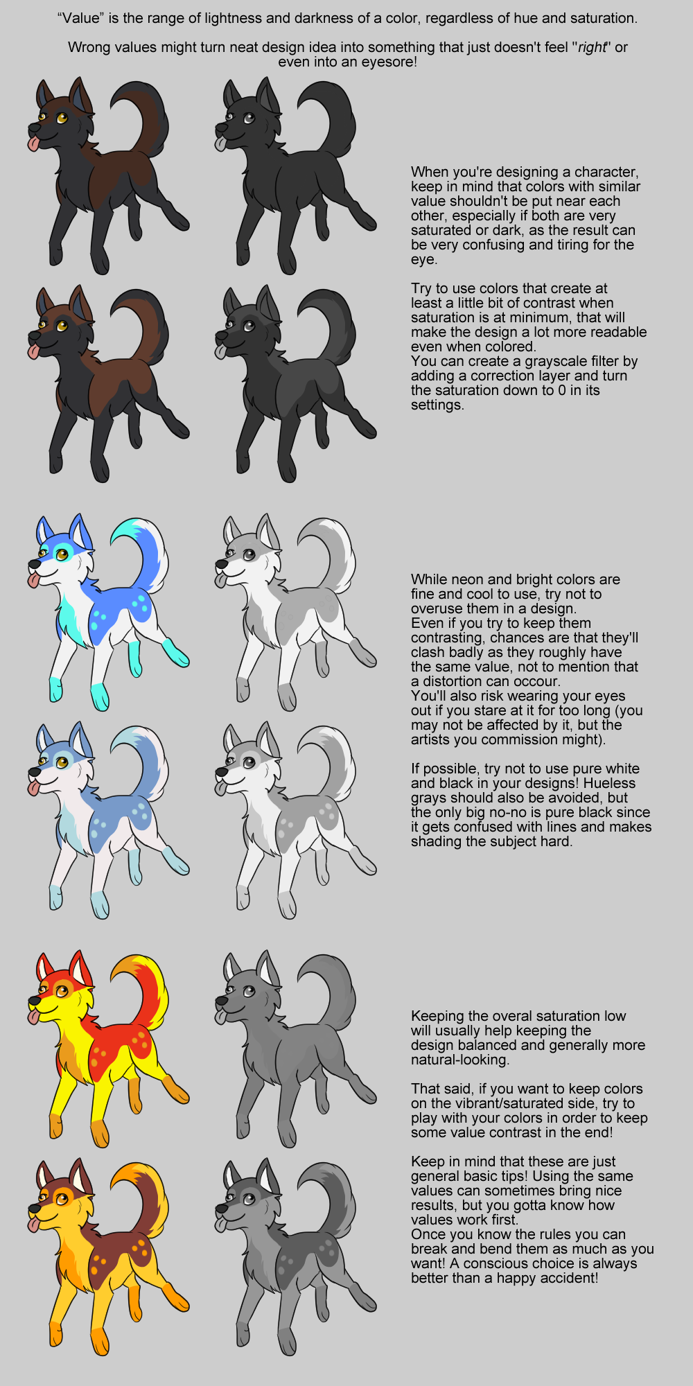

Just some things I felt like pointing out after seeing many people make the same mistakes.
I'm in no way saying that this is the only way to make nice designs, it's just the basics to make easily readable designs.
Of course you should have fun with designs, but if you also want your designs to be readable these are good things to keep in mind. Designs can be both fun and readable!
It also applies to composition and other things, but I'm just focusing on designs.
A more in-depth explanation of values can be found here => https://support.steampowered.com/kb/9334-YDXV-8590/dota-2-workshop-character-art-guide
Find this on twitter: https://twitter.com/OkamiWhitewings/status/952206005831720962
Submission Information
- Views:
- 363
- Comments:
- 1
- Favorites:
- 1
- Rating:
- General
- Category:
- Visual / Digital

Link
Jewel Wildmoon
Thank you for this! I always did have the issue with making characters that had too many bright or contrasting colors together at once.