Sign In
Close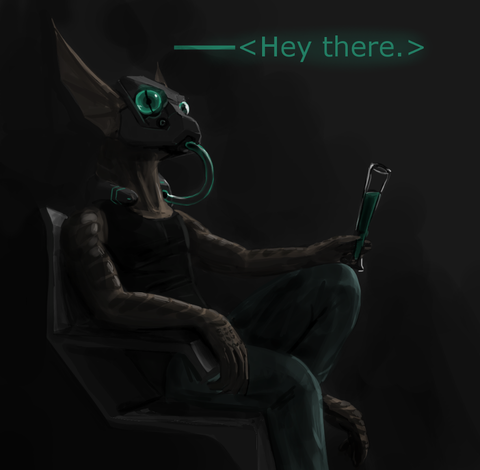
Practicing perspective and lighting, please point out anything you see that's wrong. Really any help is appreciated!
Submission Information
- Views:
- 831
- Comments:
- 4
- Favorites:
- 4
- Rating:
- General
- Category:
- Visual / Sketch
Comments
-

-

Agh, I actually left that there? Thanks for pointing it out, I don't know how in the world I missed that. It was just an oopsie on my part. However, now I want to letterbox a picture some time.
-
-

The design of the head is really phenomenal, great job with it. If I could point out anything, I'd say that the white space is very distracting.
-
Thanks! The head was really fun. I edited out the white space, don't know how I missed that.
-
Link
Vosyl
Just more on the presentation of it, you may want to make that white bar at the bottom black, and add a thinner black bar at the top. This would ideally make it look more cinematic, as if it was prep'd for Film or TV broadcasting per something like FCC sizes are. This is something of a bad example [example] Of course making it look like a still, would involve moving the text lower towards the bottom to resemble a closed caption. But simplest suggestion is just to crop that white space at the bottom off completely. For a darkly lit piece, the white space is really distracting.