Sign In
ClosedeviantArt logo rebranding electric boogaloo by Majatek
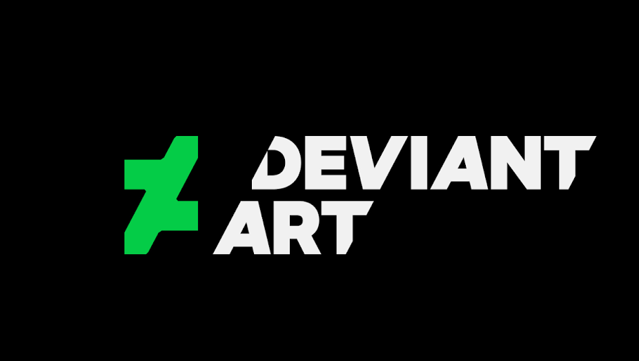
DeviantArt once again decided that it could not sit still, completely rebranding itself for the nth time (I've lost count how many times they have done this).
The lurid green eyecancer-inducing atrocity on the far left is their new logo. Can you guess how they arrived at that horrendous conclusion? Neither could I without watching their "trailer" that explained the process - and even then I couldn't fathom why they (the “creative” team responsible for such an abomination) decided that it was a good idea to lop off the closing loop of the lowercase "d" on the left part of that logo, and severing the capital "A" that completed the other half.
A good logo is recognisable and can be directly associated with a brand. DeviantArt's new logo is anything but recognisable.
Ever wanted an example on how logo design can be pushed too far, resulting in a complete failure? DeviantArt's new logo is precisely that.
Journal Information
- Views:
- 541
- Comments:
- 8
- Favorites:
- 0
- Rating:
- General
Comments
-

-

You poor soul. D:
-
-

All i can say is, f*cking Christ....
-

Got to love the amount of sheer laziness that every company is doing these days...
-
It's not so much laziness but that people forget the basic fundamental points of design. Art can be almost quite literally anything (except for white canvas painted white - that's not art, no matter how much pretentiousness certain artists like to gush about it), but a logo and/or brand design has got to be easily recognisable and cut-and-dry.
-
-

Oh wow, my brother told me about it today after work.
Seems this controversy is spreading out further than I expected. And honestly, I can understand why.
Why they outsourced outside of their community rather than got said community together to all chip in ideas for a logo (as any art community probably would) is something I don't get either. FA picks from one of their more popular artist to draw their banners, so why not DA? DA has lots of gifted artist, one of them probably coulda made a great logo, which would have promoted the site's many talented artist further.
Link
thatoneguykyle
My eeeeeyyyyyyeeeeees... eesh. Makes me want to go actively shut down my account there.