Sign In
CloseStop Making Bad Thumbnails by Ransom
Weasyl has a lot of cool features, including the ability to easily create a thumbnail on any of your visual submissions. The downside, however, is that a lot of people use that feature very badly! I see it all over the site: submission after submission with a poorly-cropped, super zoomed-in thumbnail that makes it hard to tell what the full picture is about. I think that's about the only thing Fur Affinity's got going over this place — I can tell what most of the submissions are at a glance while browsing that site. Here, when you've got a thumbnail that just shows a face, or a shoulder, or a foot, the submission becomes a mystery.
When you take your image and turn its preview into a tiny, select part of the submission, it's like trying to figure out what image is on a jigsaw puzzle by only looking at a single piece. Consider the importance and all of the effort you put into your image's composition. That quality can still be eye-catching even when the image is scaled down very small, but by cropping it, you're betraying your own work. There are so many submissions on this site, and a passing glance is the chance that you get to draw someone to your art. If nobody can tell what the submission is because of a bad thumbnail crop, it isn't likely to get clicked. And that's a shame; people here are making really cool art, but I fear I might be overlooking some quality work due to short-sighted thumbnails that just do not draw the eye!
Compare here and tell me which gives you a better idea of whether or not you'll like the picture.
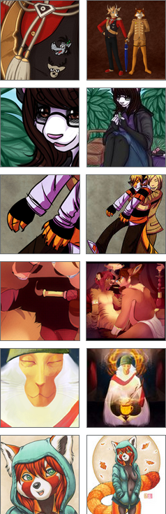
So, next time you submit an image, and it comes to that thumbnail cropping page, consider this: just because you can do something doesn't mean you should!
Journal Information
- Views:
- 838
- Comments:
- 19
- Favorites:
- 4
- Rating:
- General
Comments
-

-

You'll just have a bunch of circles fitted into squares!
-
-

Agreed. It's been talked about on their forums too, supposedly.
-
Yeah, that's good. I threw in my own two cents. A composition remains constant, no matter how large or small you scale the picture. Granted, we might lose a bit of it by trying to fit a rectangular canvas into a square frame, but I hope that will be changed eventually. Until then, it's still better than zooming way the hell in and eliminating all context whatsoever.
-
-

Yeeeeeeeah, reading this, I'm starting to realize that I actually have had a bad habit of doing just this with a lot of my submissions... Already went back into my gallery and fixed a couple really bad thumbs, and I'm gonna try to make it a habit to consider this in future submissions. Thank you for this journal! I think even the option to turn off the Weasyl-created thumbnails (as opposed to custom uploaded ones) might be a useful feature. I do appreciate having the thumbnail creator, while it could certainly be improved upon.
-
It's good to know my plea hasn't fallen on deaf ears! I feel like the thumbnail tool hurts this site more than it helps, based on the sheer volume of people who create way-too-zoomed-in thumbnails with it. I'm honoured that you took my advice to heart and revisited some of your uploads.
-
-

Ugh okay. Now the reason why I do this is because the thumbnails ARE SO SMALL on this site, it irritates the shit out of me. Even as the full thumbnail you still can't really see what the heck is going on, especially if you have a particular sized image that the box you're given to work with doesn't fit right and cuts everything else out. I don't like it. And I prefer to make my thumbnails look tidy and neat in my gallery, not a miss match of tiny un-zoomed images you have to squint to look at to work it out. I'm sorry if that bothers you, but it annoys the shit out of me and I will not do it any other way until Weasyl has bigger thumbnails like FA does.
-
Do what you want with your work, Muzz. Just bear in mind that your gallery looks like a collection of avatars that give very little context as to what the pictures actually contain.
-
I personally don't think it does. Its just your opinion? I've asked around to find out whether people are irritated by it, and most actually find it rather tidy, and doesn't bother them in the slightest. If and when Weasyl make the thumbnails bigger I'll probably choose not to make the thumbnails. But at this point in time I like the way it looks, instead of lots and lots of tiny images. I understand it bothers you, but try not to make others feel shit about it. Because I certainly do.
-
I think the problem is that there aren't that many visual clues with the "zoomed in eye" method of thumbnailing. When cruising through Browse to find new people to watch, the zoomed in thumbnails look really good, sure. But visually speaking, for most people I'd just be rolling the dice based solely on what their eyes look like. On a good gallery, the titles are going to be working overtime to tell people what they're going to be looking at. On a less planned gallery, they, well, aren't.
Of course you can take that with however much salt you want, my thumbnails openly look like trash.
-
-
-
-

I think a lot of people are using it incorrectly like you've said. The thumbnail should give an idea of what the pictures will be. I only thumbnail images that may have parts people won't want to see, and use the title of the image to tell what the rest may be. Such as vore etc.
-
I can understand that, though I still personally wouldn't bother. I figure cropping out genitalia or whatever would be redundant when they're a maturity filter in place. Ironically, I've also seen people who crop out everything except for, like, a dick going into an ass, haha.
-
I'm only concerned with cropping out fetish content that my friends aren't fans of, but some of my watchers are. It's mostly for friends to be warned.
-
-
-

yeahh, it definitely looks a lot worse and bugs me a lot more than i thought it would. it's kind of an unnecessary process!!
-

I was unaware you could skip making the icon... what do you click to skip?
-

I personally kinda liked the dissonance of cropping things down to just faces with misleading titles on everything, but I guess the big happy pictures we get, a year and a half later, are good. too. :V
-
I'm happy to see it changed, finally! This really streamlines browsing. It's no longer a guessing game, trying to figure out what I'm looking at.
-
Link
Nemo
I just skip the entire thumbnail process. I'm posting glorified circles, I don't need to make it look arthaus.