Sign In
Close
EDIT - I made an updated version here: https://www.weasyl.com/submission/659122
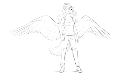
Would it be really jarring if I started drawing wings in a simpler style like this for Rebound?
I kind of don't care if it is, because I think it suits the overall style better, plus it's easier for me to ink, pose, and do pretty much everything with. Yeah, I can't think of any downfalls apart from breaking continuity.
Starting a new scene in the comic seems like a good place to do it too.
Submission Information
- Views:
- 377
- Comments:
- 3
- Favorites:
- 4
- Rating:
- General
- Category:
- Visual / Digital
Comments
-

-

Yeah, I agree. Here's an updated version: https://www.weasyl.com/submission/659122
-
-
I'm ok with this and your reasons for it sound like good ones.
Besides I have always considered art shifts between arcs to be acceptable, even major ones.
Link
Swanda
I actually think it looks much better. It's not so cluttered to look at and kinda feels like an upgrade?
THe only thing I could complain about is the midderline outlining the second layer of feathers is way too massive herre.
It kinda demands a level of attention from me, that it shouldn't have.