Sign In
Close
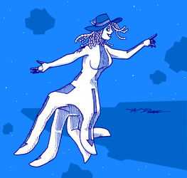

I suppose this can go here since I drew a critter. It's one of the promotional images for my typeface family, Cerulea, finally available after decades of work. This is what has been filling my time. Fourteen fonts with over 800 glyphs each. If it looks familiar, that may be because I allowed a pre-release version of Cerulea Medium to be used in the Silicon Dawn Tarot.
I wrote the pangram, too. Why not illustrate your favorite pangram, if you haven't already?
Submission Information
- Views:
- 718
- Comments:
- 10
- Favorites:
- 4
- Rating:
- General
- Category:
- Visual / Other
Comments
-

-

The most work is in the metrics. Whenever the character set grew, it was usually because I couldn't take any more of kerning pairs and felt compelled to draw more glyphs to remind myself why I liked it at all. Thereby I would trap myself into adding them to all the other weights, but this was still not as bad as kerning pairs.
-
Now imagine doing that for every single code point in the Unicode Basic Multilingual Plane (that's 65,408 glyphs!) and you'll see why the most complete Unicode fonts have very few kerning pairs.
-
-
-

I'm so glad this finally made it out :D Your dedication is inspiring, and the typeface is a delight of craft. Well done.
-
Perhaps I should also mention what I think of the font: It's gorgeous! Fonts are one of those things that you only really notice when they're bad, but this particular one (probably because I'm consciously looking at the font, rather than the words it's conveying) looks particularly nice! It looks perfect for titles of high fantasy novels, and I could see it working as an ordinary font for writing as well. I'm not too experienced in assessing the qualities of a font, but your attention to detail on the ligatures, context-sensitive glyphs, and kerning is to be admired!
-

What's a pangram?
-
A sentence that contains every letter in the alphabet. Good for testing and demonstrating type.
-
But each letter can appear more than once. Is there a name for a sentence that uses each word only once?
-
letter
-
26-letter "perfect pangrams" exist but they tend to be composed of such obscure words as to be incomprehensible. http://clagnut.com/blog/2380/
-
-
-
Link
Felthry
You never really think about it but it must take a lot of work to make a typeface. Particularly if it's meant to support a large portion of (or all of, in some cases!) Unicode.